For a long time consumer brands seemed to have all the font fun. After all they were trying to engage with consumers. B2B was the stodgy older brother when it came to font creativity since they were selling to other businesses, not individual consumers. But the reality is that B2B sells to people too. Buildings don’t search for solutions. People who work in them do. This shift to B2B prospect personalization in digital marketing has been spurred by statistics showing that in B2B purchases, more than half of buyer journeys start with a single person searching the internet for products or solutions.
The “help, not sell” marketing philosophy has also changed the dynamic in storytelling as B2B businesses realize they do have a compelling story to tell with their products and services. Throw in the recent availability of new web-friendly fonts and B2B businesses now have the impetus and the means to flex their brand muscles more creatively through their choice of font and typeset.
I interviewed two dynamite creative forces in B2B branding in Atlanta, Marsden graphic artist Penny Cannon and Realm Advertising Creative Director Carmen Garcia about the importance of font selection in B2B website design and other marketing materials.
Why are fonts important?
Penny: Everything we do as marketers is about language and communication. Humans are so visual. Subtle variations in letterforms can make a surprisingly big difference and change the emotional impact of the information that is conveyed. Choosing the wrong font for a brand is like speaking in a false accent that feels “off” to the listener/reader.
Carmen: Fonts are a core building block for any brand. Typography needs to support the positioning strategy and information hierarchy of the brand. With the right font, your target market will identify themselves with you in an instant and your message will be conveyed clearly and effectively.
How does B2B font selection differ from B2C font selection?
Carmen: In the B2B world fonts are more conservative. Companies tend to stick to the classics and you do not find a lot of early adopters. I find that B2B companies do not want to look far off from the clients they are chasing. They would rather be in synch with the style of the companies they sell to rather than stand out. But if there is a trend, it is to get more up to date with typography even if it means differentiating from their target audience.
Penny: B2B brands are more restrained in font selection. B2B branding trends tend to evolve more slowly but we are seeing an uptick in B2B brands that want to invest in rebranding and present a more engaging visual face to prospects. There is a trend toward less copy on key website pages which in some ways puts the font selection in a bigger spotlight.
What are the key considerations when choosing fonts for marketing materials?
Penny: Legibility is number one and then matching the font to your buyer personas. Another important consideration is to choose fonts that will work across the range of marketing materials and channels. It’s also important to see how the font manifests across all letters. Make sure you love every letter and see how the letters take up space in different combinations.
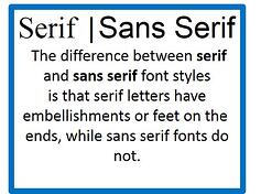
Carmen: First define your audience and brand use. Then consider legibility, unique characters of fonts (serifs, san serifs, scripts, etc.) and their range of weights and widths, as well as the mood you want to communicate. At all cost avoid trite correlations. For example, don’t use Papyrus, because your topic is ancient and avoid using Comic Sans because you are trying to be funny.
Do you have a favorite font that you return to over and over?
Carmen: I am pretty classic. I like serifs and san serifs that have been used for hundreds of years, but each project has its own unique challenges that dictate the choice of font.
Penny: I like Gotham. It’s round and clean and square vs. scrunched fonts and it plays well with others. But it always goes back to the particular brand and what is best for a specific project.
What are the biggest mistakes companies make when they choose fonts for their marketing projects and branding?
Penny: Bolding things too much. Companies tend to make more bad typesetting choices than font choices. For example, not enough space in between lines or too much space between letters. Visually, it feels wrong to the viewer, although they might not be able to articulate why.
Carmen: I like the saying, “Branding is what people say when you are not in the room.” Sometimes companies will choose the font of the moment, because it is popular, or choose the fonts they feel comfortable working with and not the one appropriate for the target market or for the product.
Is it important to be consistent in using the same fonts across channels - i.e. online, mobile, print, etc.?
Carmen: YES. Branding is all about being unique to yourself. Make the right decision the first time and then stay on script with rare exceptions. Fonts should be used in a consistent manner throughout all applications. Companies like Apple and Mercedes-Benz are immediately recognizable, in part, due to their consistent typestyle.
Penny: YES. If your brand requires a certain type of font you can’t use on the web, but you are a web based company, that’s a bad decision! Interestingly, social media has neutralized the impact of fonts in some channels. You don’t get to choose them on certain social media like Twitter. That makes it harder to stand out in that channel.
Thank you to Penny Cannon and Carmen Garcia for sharing their insights on the importance of font selection in B2B marketing! B2B websites can often look like sales slicks or laundry lists with a puzzling mixture of font types so a priority is to be clean and consistent with typography.
I think the key take-a-way from Carmen and Penny is that B2B companies have the opportunity to make subtle choices with font selection that reinforces brand identity and contributes visually to their brand story. Font decisions for marketing materials should be made with the same care and consideration as other graphics and visuals.
For more tips, tricks, tools, and insights for B2B digital marketing, social media, and lead generation, click below to sign up for our blog.