
2022 could be a year of renewal as the economy swings back into life, or it could be a time of hardship as things begin to shut down once again. A few things are certain, however: there will be more people working remotely, it will be difficult to stand out in the shifting world, and people will be looking for stability and strength in the organizations they do business with. In order to keep your organization going full speed no matter what happens in 2022, you’ll need to strengthen your visual branding. But you don’t have to throw out your current branding and start over. Here are five key items you can freshen up to powerfully face the coming year.
Make Your Logo Impactful
To be seen in 2022, your B2B organization’s logo needs to send a clear, bold message in order to tell your audience that you are resilient in trying times. One of the most important features to make clear is your text. Often, a company will have a logo that is legible at large sizes, but, once reduced to fit into small spaces like on their website and on display ads, the text becomes impossible to read.
Take a look at some of your marketing collateral and be honest about how much effort it takes for a viewer to read all of the words in the logo. If you need to squint, that’s your hint – it’s time to make your text bigger. Another key feature of your logo you can make more impactful is the shape. Simplicity is king in a logo for the same reason that text should be legible – if your audience has to exert effort to understand it, the impact is lost. Ask yourself if there is any shape, line, or other feature of your logo that can be removed without losing any important branding. With text, shapes, and any feature of your logo, simplicity is strength.
Take a look at Google’s old logo versus their newer logo. It has gone through a process of simplification that has made it more impactful.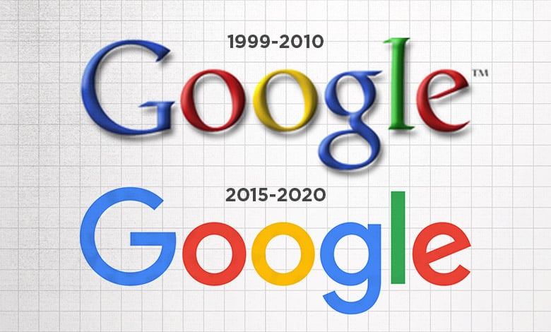
Stand Out with a Fresh Website Banner
If your audience doesn’t trust you to be strong and stable through 2022, they will be far less likely to do business with you. Your website’s homepage banner is usually the first opportunity your organization has to let people know that you stand above the competition. Don’t let it come off as weak and behind the times with a static, flat, or boring layout. Make sure your message is bold and clear for starters. That will make all the difference to an audience looking for an organization with confidence. Behind the words, add a pop of brand color by customizing an illustration or photo to show how important your organization’s identity is. Another easy way to update your look while engaging your audience is by adding animation. Bringing an illustration to life with animation will make your organization look bigger and more impressive.
Of course, it might be time to update your look by refreshing your website as a whole. To know if this is right for your organization, start by taking a look at your competitors’ sites. Is your brand differentiated in a positive way? Are you keeping up with digital trends like animation and interactivity? Also, ask if your website accurately portrays the image that your organization should present and provides the experience that your audience desires. Making sure your website is up to date is essential to increasing your audience’s engagement in the coming year.
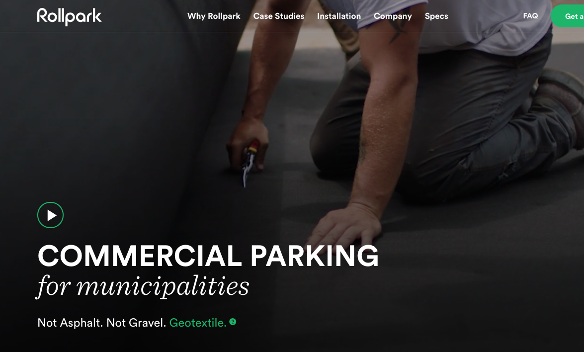
Check out Rollpark’s engaging banner – it combines background video of their work with animated headline text.
Make Your Brand Colors Pop
If your organization doesn’t have a strong color palette, 2022 is the perfect time to update it. Weak color palettes often include a limited range of colors, leaving few options to create deep, engaging visuals that will make your audience want more. Only having two or three colors is ok, but what truly limits a color palette is not having a color that pops. For example, two shades of blue will be a lot less effective than having blue and orange. Orange brings excitement and energy to the brand, making it a great color to put on call-to-action buttons. It will entice your audience to take action.
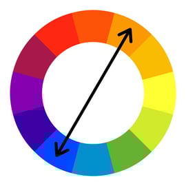
To ensure your color palette excites and engages your audience, take a look at a color wheel, such as the one below. Find your main brand color. Then, move at least a third of the circle away in either direction. The color you land on is a good candidate for a new addition to your brand’s palette. You can also get help from websites such as Coolors.co and Colormind.io. These sites allow you to input your current brand color and automatically generate more colors based on your starting point. You should be able to get some great ideas that will bring new life to your organization’s B2B visual brand. These tips will help you avoid dull and flat marketing materials in the coming year.
Use the color wheel to find more colors that will pop in your branding. The color opposite to your brand color on the wheel is known as its compliment – it will stand out the most when put next to your current color.
Imagery
Using the same old stale stock imagery can hamper your organization’s mission. Your audience is less likely to view your organization as ready to take on new challenges, and they’re more likely to see your organization as behind the times and unsure about its message. To get better imagery, there are a few strategies to keep up your sleeve. First of all, opt for less posed-looking pictures.
If a scene in a photo looks like it wouldn’t happen in real life, it won’t help your brand. Second, try something different and creative. Your message might be better said with a visual metaphor. For example, a picture of a butterfly instantly communicates the idea of transformation in a way that an image of people working on a whiteboard can’t. Third, give your images a unique style based on your branding. Add a color overlay, a shape, or a pattern that will instantly set you apart from your competitors. Doing something different and unique with your imagery will set you apart in 2022
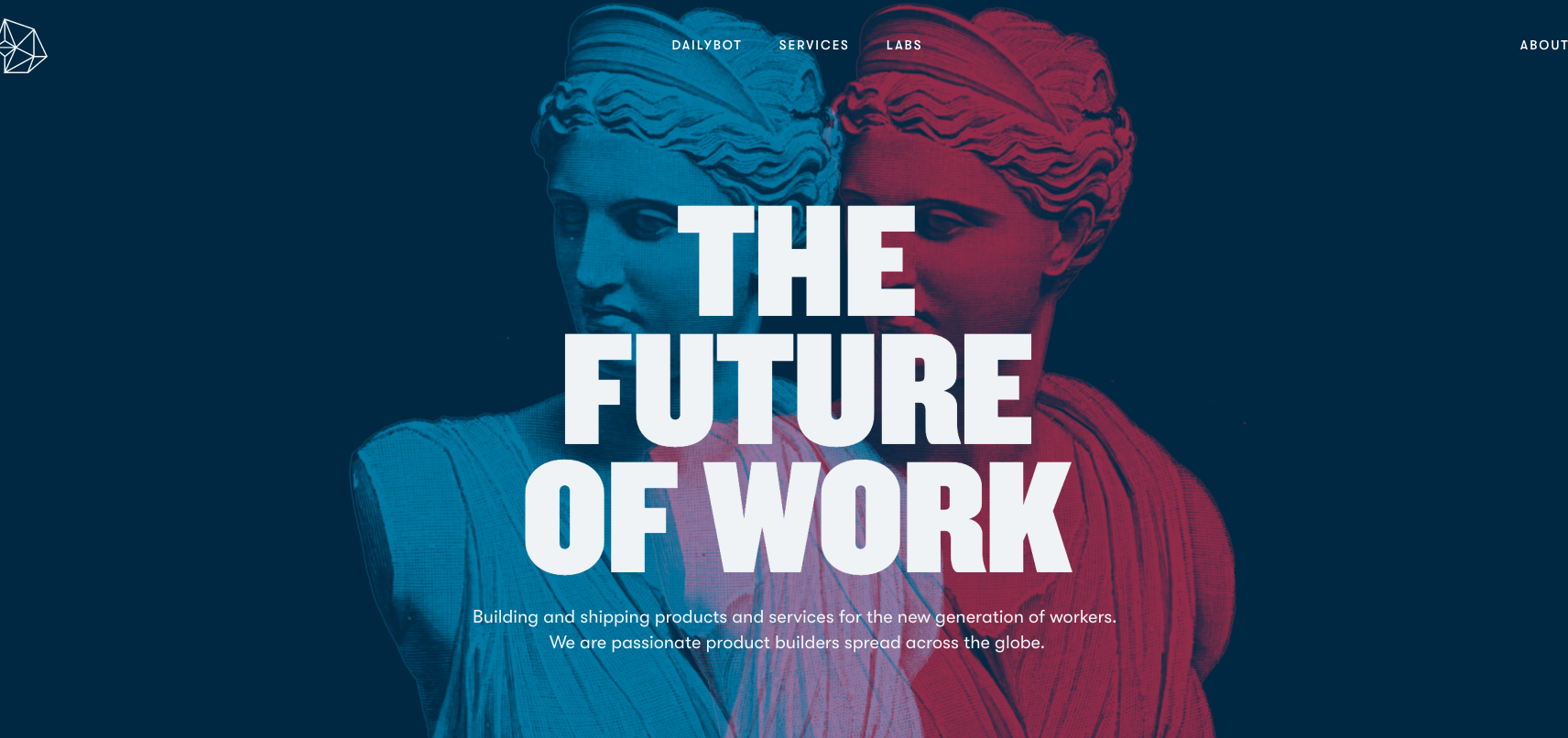
Rocka used generic imagery to create a unique brand experience by adding various effects.
It’s Time for Brand Guidelines
Strong visual branding needs a strong backbone. That backbone is the set of brand guidelines, and it’s a factor that is often forgotten by B2B organizations. Brand guidelines are a set of rules and recommendations for the different aspects of the brand including the logo, color palette, fonts, imagery, and styling techniques. The rules for a logo’s use, for example, will cover how to ensure the logo is legible, looks consistent, and is used in the most impactful way possible. Without such guidelines, an organization risks creating marketing materials and other documents that are a disservice to its goals. Without this backbone, your organization’s brand will falter where it matters most. Next year will bring new unknown challenges for your brand – make sure it’s ready with a set of brand guidelines.
Flip through Uber’s Brand Guide to get a sense of how this could help your organization.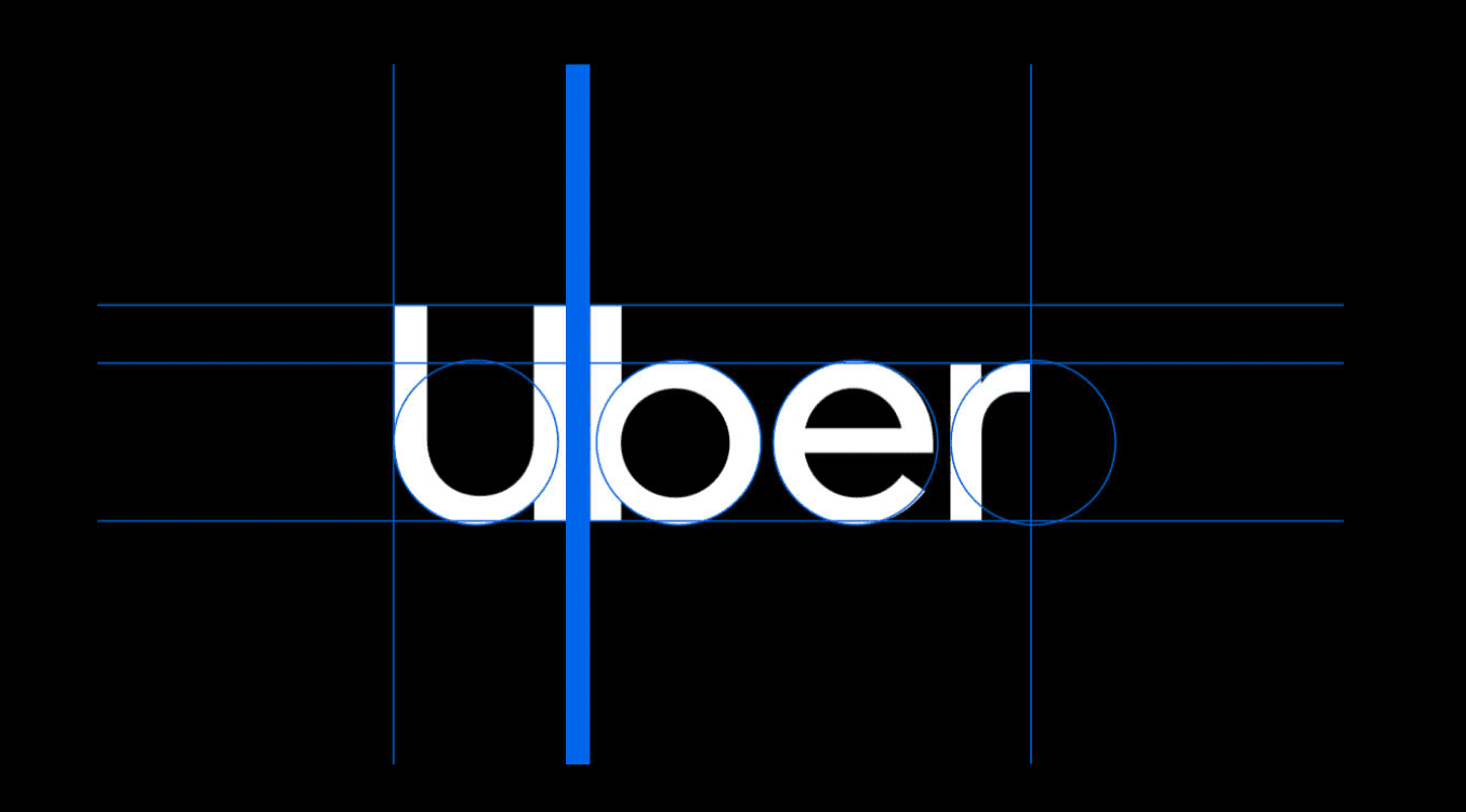
No matter what happens in 2022, it will be the perfect time to show your organization’s strength through your brand. Refreshing and updating the brand features above is a great way to be ready for whatever the year brings without completely starting over. Your audience will respect you more than ever and know that they can rely on you through either tough times or a resurging economy.
Learn more about getting your B2B brand ready for 2022with our infographic:


